Earth Tectonic Maps
Earthquake in China, cyclone in Burma, volcano in Chile — and that’s just this week! — tragedy, chaos and havoc, onto which our era’s technology and satellite imagery zooms in, gives us an eyeful of detail.
Glaciers melting in Switzerland, tornadoes whirling across North America, ice sliding off Antarctica, floods here, drought there; disappearing bees, blooming algae, all catalytic events onto which our era’s technology and satellite imagery zooms in, gives us another eyeful of detail.
And in this mist of confusion, we use our world maps only to put some focus of attention into slightly wider context, identify our study area. Yet we now have the means to collect and synthesize data into concepts global in scope, concepts of utmost importance to life as we know it.
We continue to debate the relative merits of competing theories, and the relative influences of interconnected events, on world maps which rely for their construction on mathematical techniques essentially unchanged for nearly half a millennium, techniques pioneered by Gerhardt Mercator in 1569, who “at a time when new discoveries had outmoded medieval and ancient maps, and explorations had widened horizons and created a need for better maps, employed the new principle of perspective to draw up a map which broke with the principles of Ptolemy and which, with later improvement, has been basic to cartography ever since.”
That’s from Carl Boyer’s 1968 History of Mathematics. Let’s update it: We are again at a time when new discoveries — and our theories explaining them — have outmoded conventional projections, and explorations have widened horizons and created a need for better maps.
So where in 1954 (I am very old) my apprentice master was selfishly wishing for a world map “a heron could use to get to Brazil,” we in 2008 wish selfishly for a world map able to help settle the debate on global warming; a world map able to present competently the surface of an irregular asteroid; a world map able to help communicate the inextricably global theories of tectonics.
Wheu, I reach my point. Sorry that took so long.
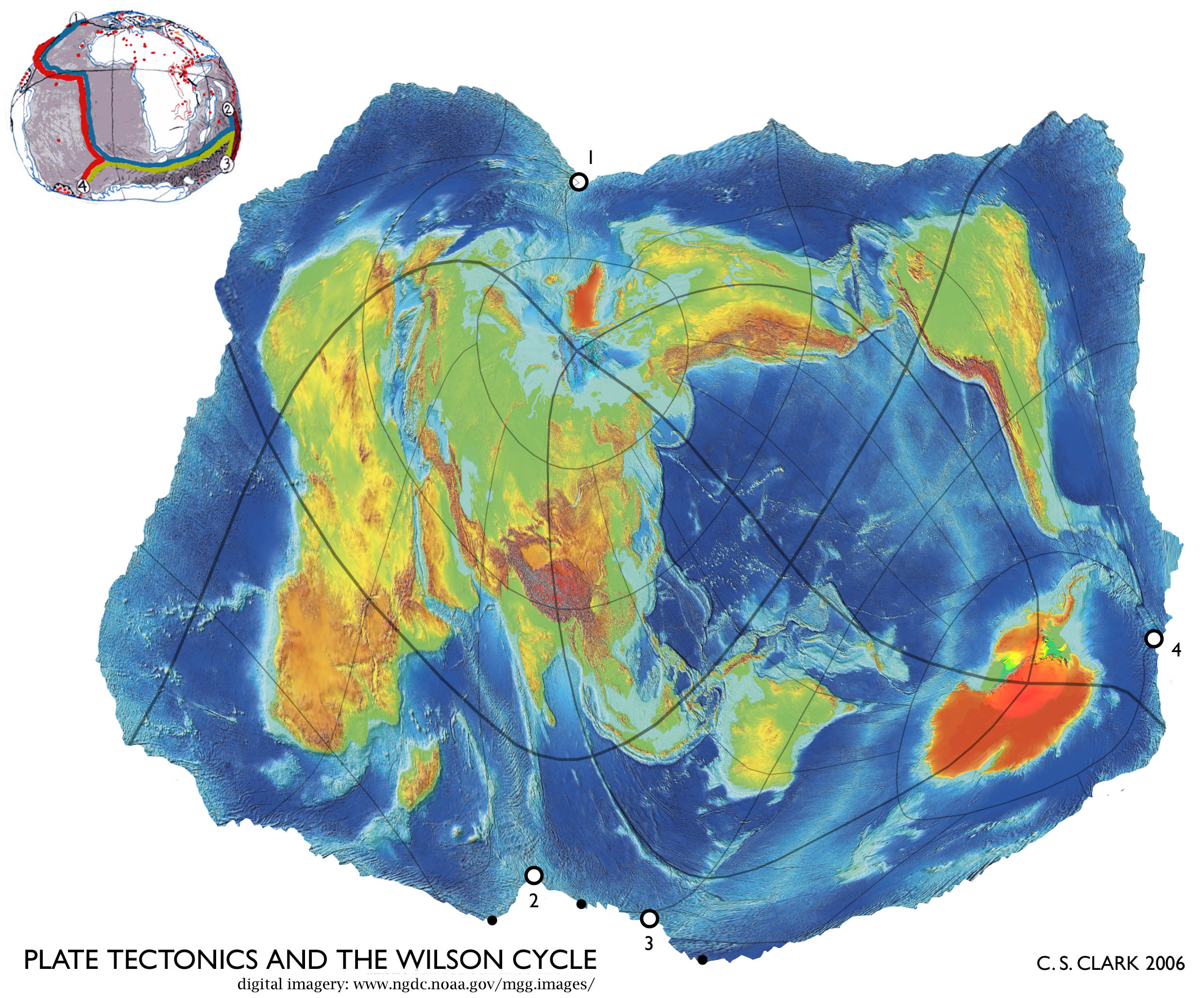
There is a prominent theory in plate tectonics that looks at the evidence of the mid-ocean ridge producing new sea floor, the trench-rimmed, old Pacific Ocean, where “old” sea floor is supposedly being subducted (recycled into the planetary interior), and the (nearly) trench-less, young Atlantic Ocean and from that evidence propounds the an expanding Atlantic Ocean will eventually push the continental plates that ring it to close the Pacific Ocean. They call this “The Wilson cycle,” giving it great authority by naming it after Tuzo Wilson, one of the pioneers of plate tectonic theory.
It does not matter for this post that recent discoveries of seismic tomography (the science of using earthquakes to in essence take CAT scans of Earth), among other discoveries, contradict the Wilson cycle, nor that many geodynamicists now consider the Wilson cycle simplistic bunkum.
What matters is that here we have an idea which is global in scope. Nothing can happen “here” (pick your point) which does not affect “there.” The theory’s crux is that that portion of the mid-ocean ridge which traverses the Atlantic Ocean is dominant. Given enough time (says the evidence of the trenches) it will prevail over the rest of the mid-ocean ridge: The Wilson cycle says the Atlantic Ocean ridge is critical to the evolution of the Earth’s plates.
Can we make a world map which unequivocally illustrates the basic tenets of the Wilson cycle? If so, the better off we are to appreciate both the fundamentals and the nuances of the overall dynamic, and small-scale (regional) causes and effects; the better off we are to communicate, discuss and appraise the theory as plausible or improbable.
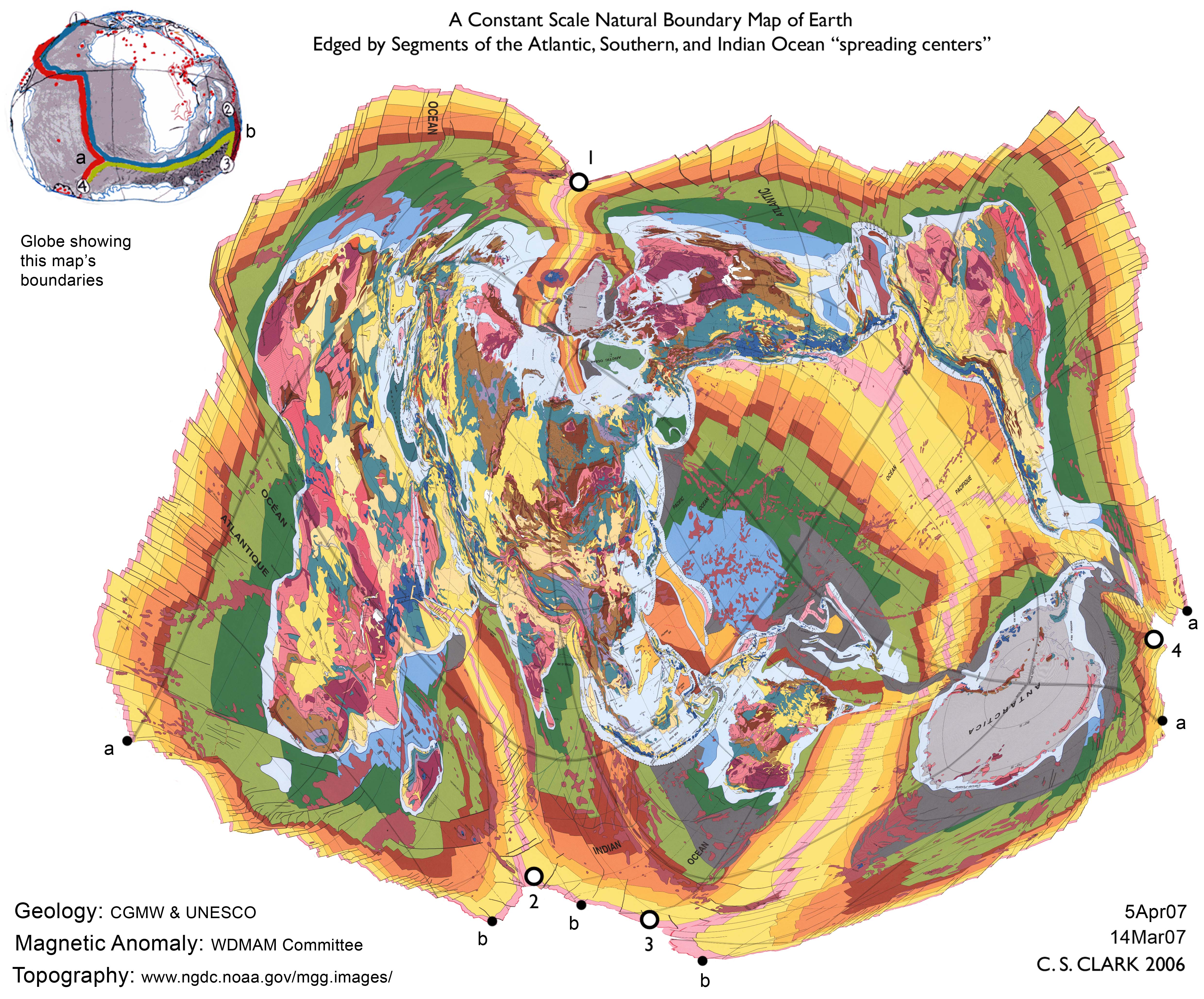
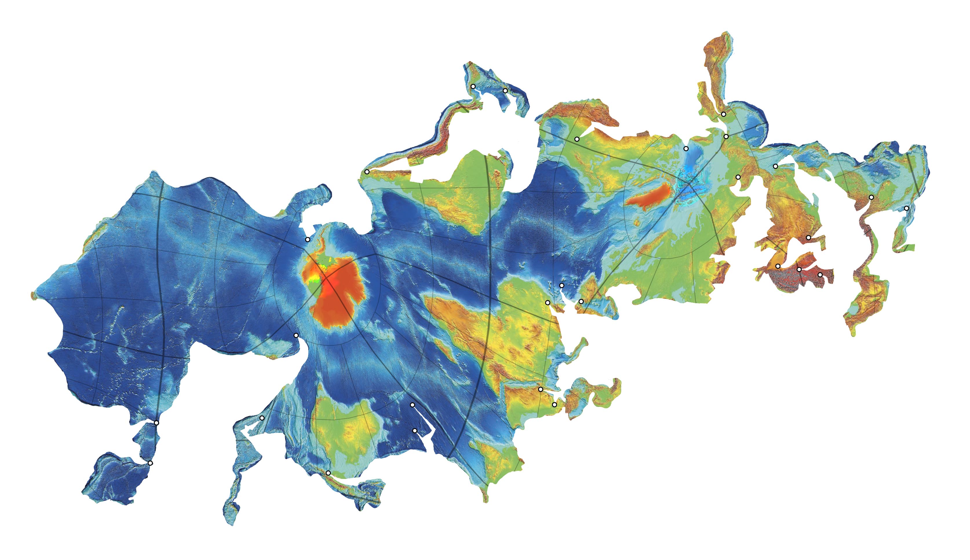
Because csnb lets us select any (connected but area-less, that is, like a tree when seen on the globe) subset of a natural boundary, we opt for the Atlantic’s “critical” mid-ocean ridge as our map’s edge. The resulting construction will be the desired map, the world seen in terms of the Atlantic ridge; the world seen as framed by the Atlantic ridge. The sketch at upper left shows the map’s boundary on a globe. Topographic data displayed in the map courtesy of NOAA.
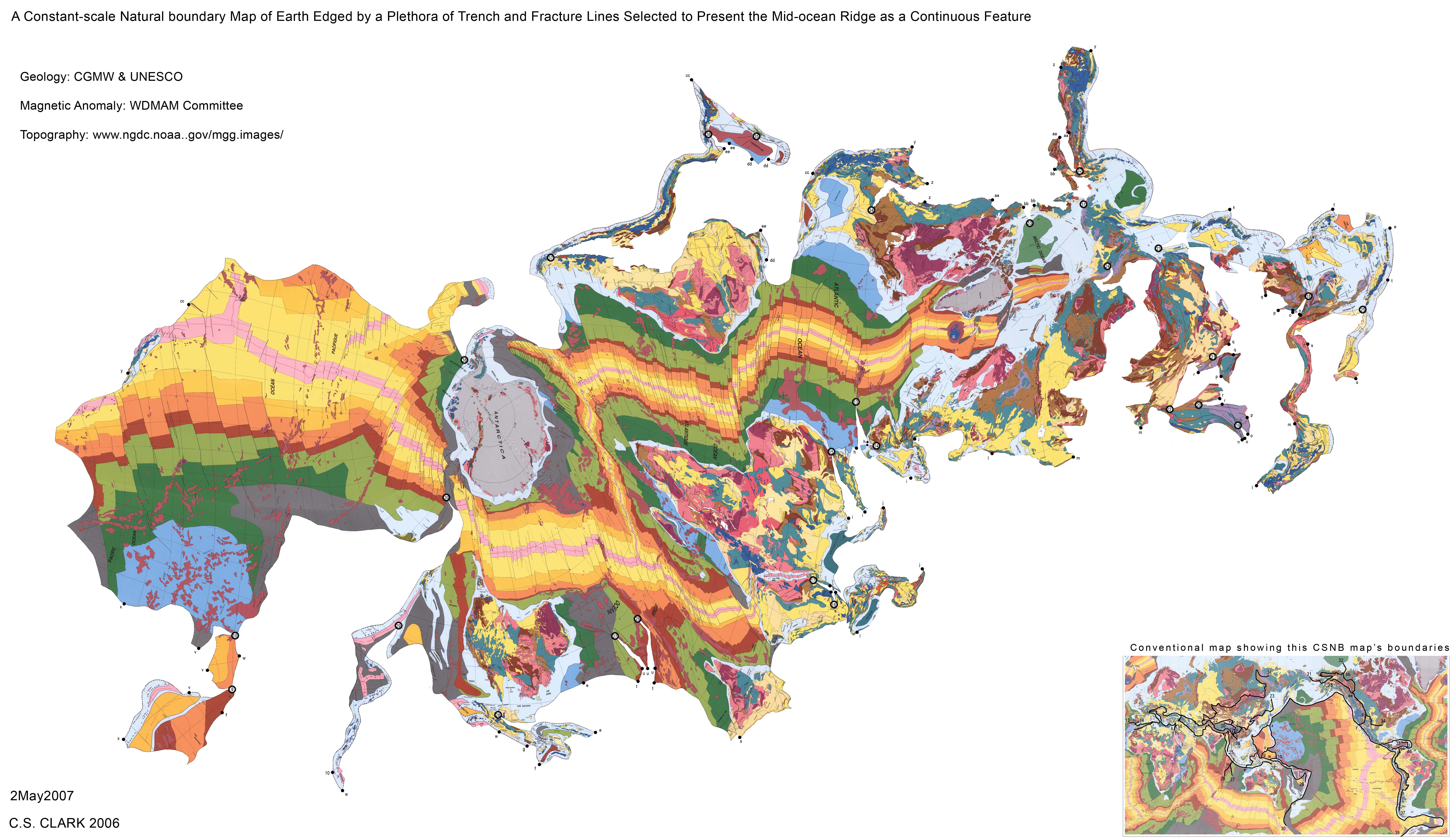
And here is the same construction displaying geologic data, courtesy The Commission for a Geologic Map of the World www.cgmw.net:
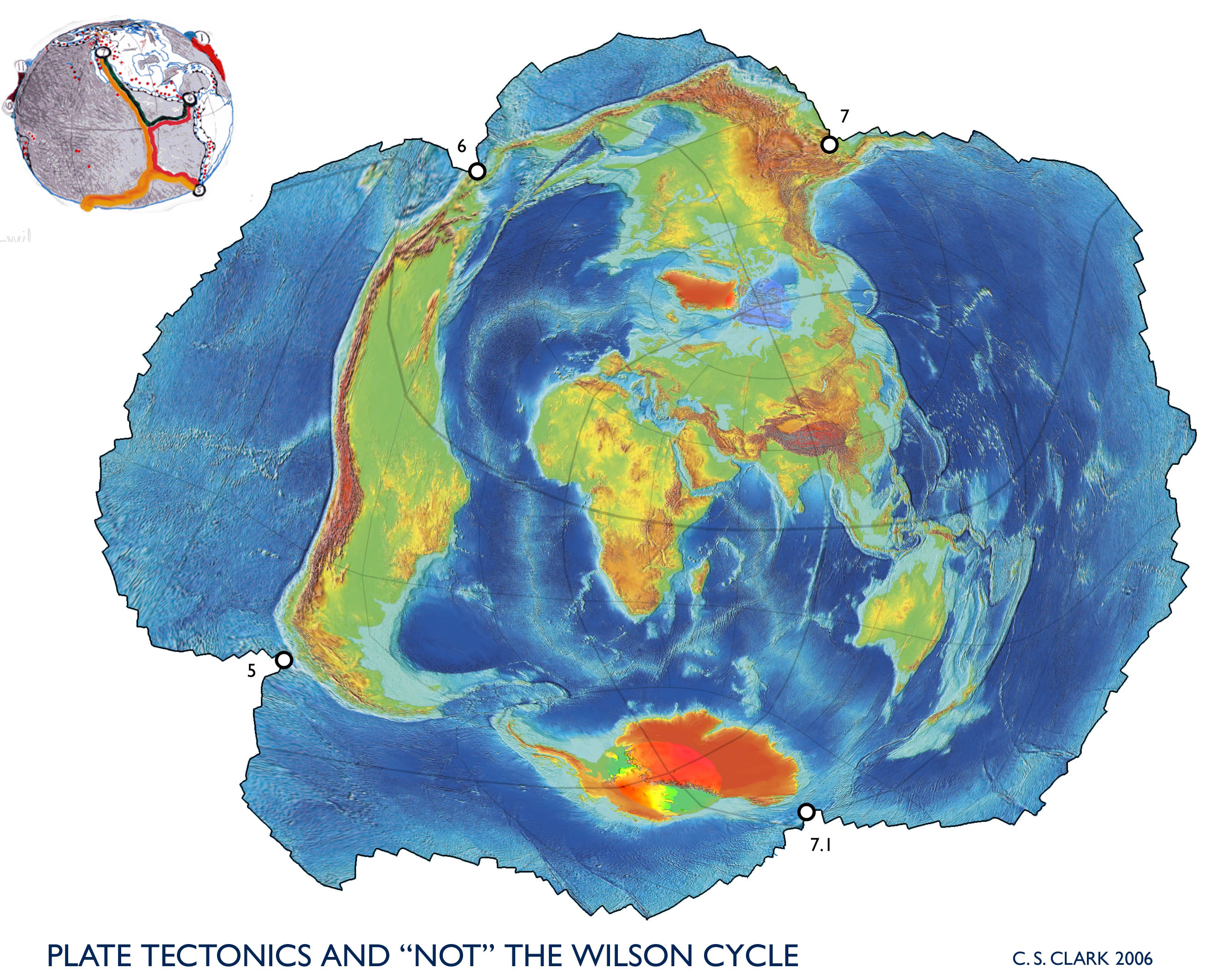
This map, like many csnb maps, implies its own alternative construction, a map edged by that portion of the mid-ocean ridge in the Pacific Ocean. With that alternative map we have cartography now leading the way for theory, because what narrative may be composed from it? To wit:
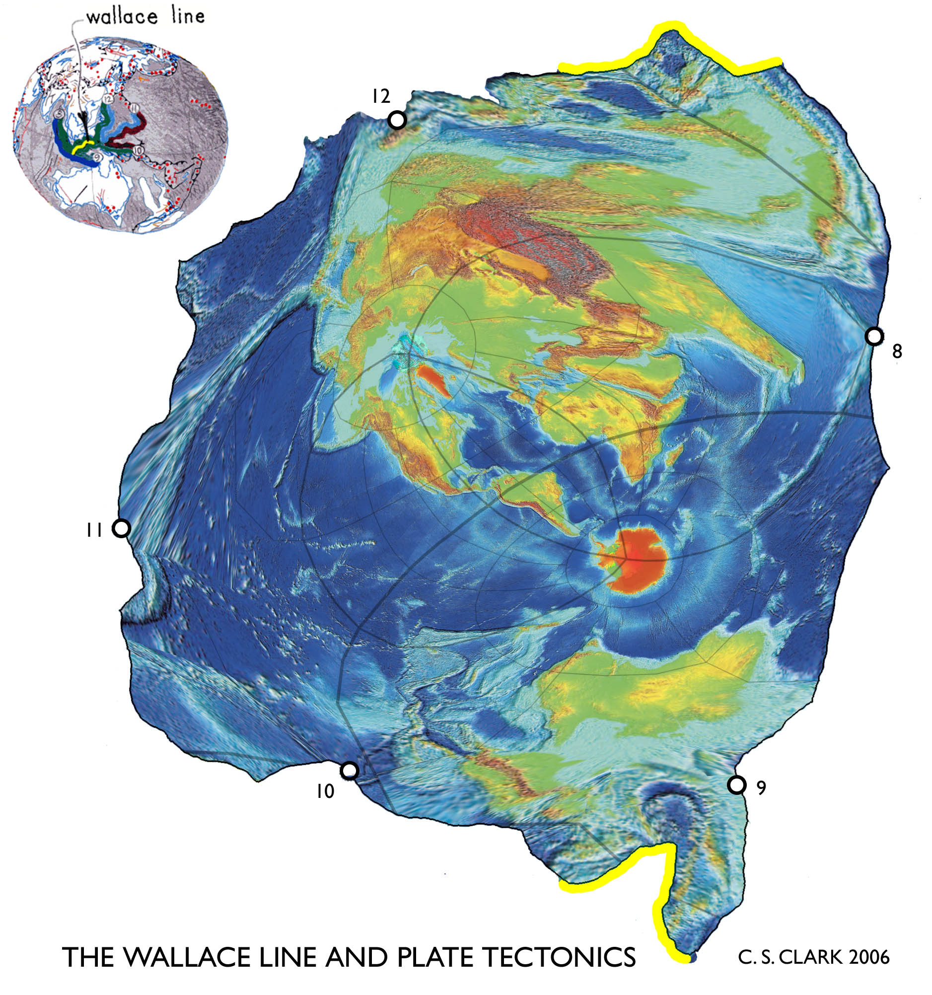
And, like csnb map #1, we may get multidisciplinary in our subset of selected map boundary. Here is a map which illustrates the continental drifts associated with something called the Wallace line, so named by 19th century naturalist Alfred Russel Wallace, a colleague of Charles Darwin who proposed that the sharp dichotomy of distribution of flora and fauna along the Indonesian island arc could be explained by continental drift. The edge of this map is Wallace’s line plus all the nearby tectonic lines:
If we discount plate tectonics and continental drift, what remains? The midocean ridge, our planet’s largest topographic and geologic feature. Can we make a map that illustrates a concept-neutral position? Yes. With csnb we simply subtract the mid-ocean ridge from the set of all active tectonic lines and see what we get:
Here is the same format showing geologic data:
An article describing earlier versions of these maps is here (search for issue #31), the newsletter of New Concepts in Global Tectonics, http://www.ncgt.org an ongoing forum of discussion of geodynamic alternatives to plate tectonics.
I’ll do another post shortly showing how all these csnb tectonic maps share the same “parent” map ( map which uses as its edge the entire set of active tectonic lines), a map which may be folded to make a globe that responds to touch in mimicry of tectonic action; and how any of these maps may be used to generate “children” maps (maps with use a smaller subset of lines as the map edge).

June 18, 2008 at 1:41 pm
geofest date:
who can layer GPS on each map ?
April 30, 2012 at 6:24 pm
I stumbled into a small time fray on another science page by suggesting the earth is 25% larger now as opposed to the days of Pangea due to mid-ocean spreading in the Atlantic. Nasa had the article but I don’t recall….Am I nuts? If I am correct the differential spread of the Atlantic mid-ocedan rige is 10 times that of Pacific Ocean Subduction. Therefore the earth is larger and spins slower now….not more mass but more volume. Yes?
August 30, 2012 at 6:23 pm
Do you have high-quality prints of your maps available for sale anywhere? And if you don’t, do you mind if I just print them out myself? (Not to sell or anything, I just think they’re gorgeous.)
August 30, 2012 at 9:04 pm
I’ve done that in the past (almost every map on the website exists as a much larger file), and with new printing technologies, it’s not as expensive as it used to be. But be warned, it’s not like purchasing a bulk-printed poster. Which maps are you interested in, and what size?
August 31, 2012 at 12:00 am
The csnb maps with geologic data. (Especially https://rightbasicbuilding.files.wordpress.com/2008/05/wilsonearthcsnb_geology_copy.jpg) I’m afraid it’s pretty price-dependent, because I don’t have unlimited resources over here. But I’d be interested. (I also have access to poster-size printers, if you’d be willing to let me pay you just for the right to print one copy myself.)
August 31, 2012 at 1:49 am
Sure we can work out something. . I’ll send you an email and we can wrap up the details offline.
January 7, 2013 at 3:54 pm
Hi there, I am looking for a key in understanding these maps in terms of the different colours used and what those colours are referring to. Is there anyone who could briefly explain this to me or referring me to a link deciphering these maps? Thank you
February 20, 2013 at 12:58 am
Mr. Clark, These are strikingly beautiful and interesting projections! I am wondering if I might be able to get access to some high-resolution image files, as it seems an earlier commenter has done. Much obliged!